From the soft pastel palettes carried through Wes Anderson’s films to the cool tones found in Denis Villeneuve’s futuristic scenes, color grading is a post-production editing technique filmmakers employ to evoke certain emotions, set a distinguishable style and enhance a story. At Trilix Studio, our skilled team of colorists leverage color grading to craft compelling stories for our clients.
When color arrived on the scene.
Leading up to the 1920s, cinematic works could be characterized by their full, or partial, absence of color. Early film production brought black-and-white films first to the scene, followed by advancements in Technicolor process films — resulting in works with limited color palettes.
After the 1930s, Technicolor Process 4 films surged in popularity, introducing a full range of colors to filmmakers. The vibrant look of Technicolor Process 4 is evident in works of the era, from the mesmerizing world of “The Wizard of Oz” to the warm scenes of the South in “Gone with the Wind.”
As color film technologies evolved, peaked and shifted to digital video, filmmakers found they could manipulate the colors captured from the footage in post-production to convey a certain visual tone — not only for the big screen but also across industries.
Eliciting emotion with color.
Color grading sets the visual tone in concept development, guiding the creative decisions made in production, such as lighting, shooting, wardrobe design and environment. Colorists work closely with production teams to develop a look that will best tell the story.
While colors can be edited in post-production, capturing true colors in production is foundational to creating an authentic visual experience. At Trilix Studio, our colorists aim to capture the achieved look as much as possible in production, with the rest dialed in during post-production.
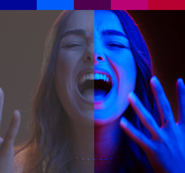
Rooted in principles of color psychology, color grading elicits emotions from the viewers in alignment with the story. Warm palettes with colors like red, magenta and orange can convey feelings of passion, romance and energy. In contrast, scenes awash in cold color palettes can set an ominous or sterile tone, evoking feelings of fear or unfamiliarity.
However, some expert colorists have flipped this concept — such as in Ari Aster’s “Midsommar.” As the movie becomes increasingly grotesque, Aster incorporates more colors and applies a soft, desaturated color grade, juxtaposing viewers’ warm associations with sinister feelings as the plot progresses.
Creating a sense of time and place.
Color can also evoke emotions by transporting viewers to a period in history or by capturing the essence of a particular place. The intensified yellow, green and red hues in “Amelié” take viewers to the whimsical streets of Paris, France. In “All Quiet on the Western Front,” viewers are enveloped in a gritty world of war, drenched with a saturated blue color grade.
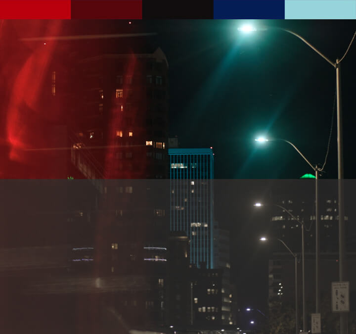
Trilix Studio leaned into this technique during the post-production phase of Addilyn Erica’s music video for her single “Street Lights.” Some of the song’s undertones nod to ’80s music, so our skilled team of colorists replicated this time twist by enhancing the duotone neon lighting captured in production while treating other scenes with a vintage filmstock look. After color grading, our colorists layered subtle grain and light leak effects to replicate the imperfect look often found in 8 mm film.
Color grading versus color correction
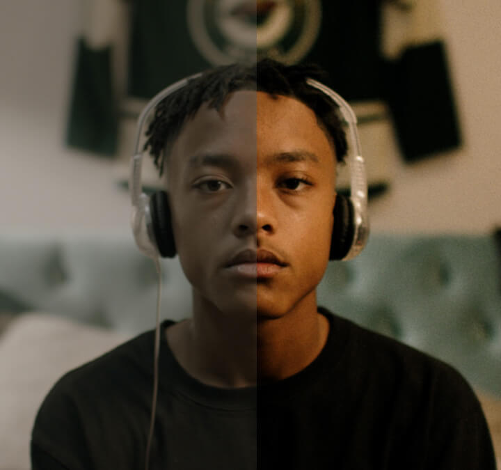
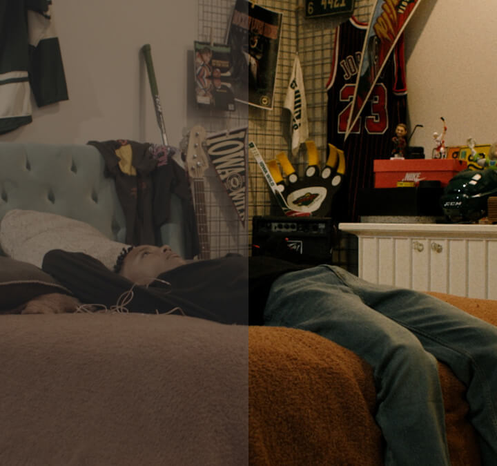
Before color grading, our colorists ensure accuracy and consistency with color correction. While color correction and color grading are often mistakably interchanged, color correction is used to replicate the hues and tones perceived by the human eye. Even the best cameras fail to capture raw footage indistinguishable from real life, and with the help of editing software — like DaVinci Resolve — our team adjusts factors like color balance, exposure, contrast and white balance.
Below are some shots from the Iowa Wild’s 2023–2024 season hype video, showing scenes before and after color correction.
The color correction process may take several passes before a creative look can be achieved through color grading. Once all the footage has been color corrected, our colorists can add color grading effects. This process is demonstrated in our work for Iowa One Call’s “Risky Ronnie” spots.
For brands and advertisers, color grading is an important part in formulating compelling and resonating stories. Our award-winning colorists leverage color grading techniques that best fit our clients’ message, branding and goals.
Ready to create a color experience for your brand? Our Trilix Studio experts are here to help.


